
Click to enlarge image
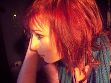
Today I made a very rough mock-up of what my finished magazine might look like. I took a photograph of Blood Red Shoes from the internet and cut Laura-Mary out, originally there was a man in the photo and quite a bit of background. i cut her down so it was more of a midshot than midlength - we can only see her top half and a little of her skirt. I like this photograph as she looks very striking and I will get my model to pose in the same way. I took my title font from www.dafont.com and I chose this one as it has a very disco or 60s theme, it is also very noticeable and one of the most dominant things on the page. I used a font from the internet to write "BLOOD RED SHOES: UK dates announced." and had this writing on a white background layered slightly over her image, this is good as she is the main component of the page and this leads you to the headlines. I got an image of a barcode from the internet and put it sideways in the bottom right corner of the page with a fake website "www.thebeat.com" underneath. This made my mock-up look more professional. In a baby blue circle I typed the words "Our top 50 albums to look forward to in 2010!" and I think this looked good as it co-ordinates well with her lipstick but keeps the magazine looking unisex. When I make my magazine I will ensure that I use a colour scheme that doesn't clash with my models clothes or make-up. The botttom strapline says 'VAMPIRE WEEKEND: exclusive!' in a font I got online. This this draws attention to my magazine as it makes it stand out as the only one with this feature. I only have 3 features on the front of my mock-up and whilst I like the way that this keeps it simple and makes the image the main feature, I will add more coverlines to my final piece.


1 comment:
The image is very well cut out considering what the original one looked like!
Post a Comment