A Few Test Shots


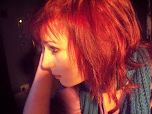
Here are a few unedited photos I have taken whilst testing photos, methods and angles. I might use a couple in my final work as I'm really proud of what I've taken.

Front Cover Mock-Up


Click to enlarge image
Today I made a very rough mock-up of what my finished magazine might look like. I took a photograph of Blood Red Shoes from the internet and cut Laura-Mary out, originally there was a man in the photo and quite a bit of background. i cut her down so it was more of a midshot than midlength - we can only see her top half and a little of her skirt. I like this photograph as she looks very striking and I will get my model to pose in the same way. I took my title font from www.dafont.com and I chose this one as it has a very disco or 60s theme, it is also very noticeable and one of the most dominant things on the page. I used a font from the internet to write "BLOOD RED SHOES: UK dates announced." and had this writing on a white background layered slightly over her image, this is good as she is the main component of the page and this leads you to the headlines. I got an image of a barcode from the internet and put it sideways in the bottom right corner of the page with a fake website "www.thebeat.com" underneath. This made my mock-up look more professional. In a baby blue circle I typed the words "Our top 50 albums to look forward to in 2010!" and I think this looked good as it co-ordinates well with her lipstick but keeps the magazine looking unisex. When I make my magazine I will ensure that I use a colour scheme that doesn't clash with my models clothes or make-up. The botttom strapline says 'VAMPIRE WEEKEND: exclusive!' in a font I got online. This this draws attention to my magazine as it makes it stand out as the only one with this feature. I only have 3 features on the front of my mock-up and whilst I like the way that this keeps it simple and makes the image the main feature, I will add more coverlines to my final piece.

Font Experimentation


I have experimented with different fonts to use for the logo or coverlines of my magazine; however the ones I have used are too complicated to use as coverlines. Here is a selection of ones I liked, let me know which ones you think i should use :)

Audience Profiling Sheet

I took note of the type of people that would read my magazine and noted them down in the document below.

Audience Profiling

My Pitch

Here is my slideshow that I presented to the class when pitching my ideas. I made it busy with pictures rather than text so my audience didn't have too much to read and could concentrate on exciting photos. This also ensured that I didn't just read off the slideshow and had lines planned in my head.

Colour Scheme Options


Here are eight colour schemes that I have experimented with on paint. For each I chose 3 colours that compliment each other, and I think I will use a white background. Whilst I like the pink and purple schemes I believe that these may be too gender specific – my magazine would look directed solely at girls and young women. I will experiment with a couple of these colour schemes when I start creating my magazine but for now I think I will use one of the green or blue schemes as they are gender neutral and quite calm and naturalistic, this is what I am going for with the general feel and scheme of my magazine. Most of these schemes have a grey in them, this is because my picture will be monochrome and I want some of the coverlines to fit in with this scheme but I want others to stand out in a different, brighter colour. Red seems to be a colour that is used in many magazines schemes and for this reason I might consider it as it is bold and makes things stand out without looking tacky – a green or blue might not stand out.

Evaluation of Pitch Feedback

After pitching my ideas to the class and receiving their feedback, the first thing that they said which I have taken further is to use The Beat as my magazine title. Originally it was between Sounds and The Beat as they are both catchy, simple, and have a musical feel, but my audience unanimously agreed on The Beat so I have chosen to use it as my title.
Secondly they mentioned that my genre was a little too general as I said I would aim it at everyone so I have decided to narrow it down to mainly Indie/Britpop/Rock with elements of other genres. Some of my favoured music is Britpop such as Pulp, The Beautiful South, Blur, The Housemartins and Madness but as the majority of these bands have split up I decided that it was a dead genre and should only be a small aspect of my magazine.
Thirdly they said I should have a better developed colour scheme as I had little idea of what I wanted to do with the colours, so after a lot of deliberation and experimenting with colours on paint I have decided to use blacks and greys but with some blue and greens. This is because although I liked the purple and pink colours I experimented with, they were quite feminine and could put boys off my magazine. Blue and green are much more gender neutral and would stand out nicely against the monochrome whilst blending in with my outdoor photographs.
Overall I took quite a lot of my audiences feedback into my own work and am pleased with what I came out with after my pitch.

Feedback

Today I presented my pitch to the class and told them the basic details of what I plan to do with my magazine. I told them that I wanted to make it about general music but focus on Britpop/Indie/Rock music. My title choice was between Sounds and The Beat so I asked for people's opinions on title choice. I've also planned to have a monochrome colour scheme with one or two brighter colours to make it stand out, and decided to take photos of people in naturalistic, casual poses.
My feedback was that my idea was overall very developed and a good one to use but I need to think of conventions to make my magazine stand out. I have decided to call it the Beat as the overall consensus was that this is the most catchy, interesting title and it has a 'beat' to it.
Feedback for My Pitch

NME Double Page Spread Annotation


I annotated this double page spread to see which conventions I am required to use in my own piece of work. For my own article I have decided to keep the design and colour palette simple but to break up the text with pictures and quotes to make the page look more busy and the text less tedious to read.

Contents Page Annotations


I have annotated the contents page of Q magazine and have decided to take several techniques and components into my own work. Firstly I will use an image of a 'band' featured in the magazine as the main part of my contents page. Secondly, will have the number and main point of the features in a large different coloured font then give further insight into the article underneath in smaller black font. I might also seperate some features from the main text in boxes so to draw attention to them.

Annotated Front Covers


Click images to enlarge


In researching for making my own magazine I annotated these front covers in detail to see which features I wanted to use in my own work. Overall I have decided to use a simple, straight to the point design and three colour palette. The photo and majority of the cover may well be in monochrome, with colour used when I need to draw attention to a particular feature. I've decided to do this as I like simplistic front covers where the image is the main component.

Brainstorm Of Title Ideas


To help think of ideas for my magazine title I created a brainstorm on bubbl.us of words within the lexical field of music. At the moment I like muse, sounds, and antiphonal as prospective ideas. Antiphonal is a favourite because of the enigma code - not many people will know that antiphonal is the word for when two or more voices or instruments take turns to play in answer-question style, or in argument. I also like this title because it refers to a style of singing I enjoy.

Photo Inspiration

When researching music magazines and photoshoots I came across this one of Blood Red Shoes that I found particularly interesting. I like the way that the band members are seemingly oblivious to each other and emotionless; yet their nudity makes the photos much more personal. There is a lot of contrast in emotion and colour in these photographs which makes them appealing to the eye but also enigmatic as we question what the story is behind them. The style is very artistic and symbolic; for my magazine I hope to take photos in a similar style to these (without the nudity!) as they are very visually interesting and pleasing. I also looked at a lot of photos that were taken outside and had a summery, naturalistic feel to them; if the weather isn't too cold and wet I plan to take idea into account as well. I will experiment with different styles of photos and research further into photo shoots and methods.

Moodboards

1: Band Photographs Moodboard & Inspirations
click to enlarge


With this moodboard I gathered a collection of photographs from shoots of bands that I like. Overall I aimed to create a naturalistic, relaxed feel with this moodboard and I think I achieved it. I don't enjoy photos that seem to posed and I like these as they help you to see the artists relaxed; it can help you feel more connected with them. In some of the photos you can see a lot of the outdoors and nature; I would like to do the same kind of thing with my own photographs and magazine but it could be hard as I will be creating it during the winter months.

Moodboard 2: Magazine Covers
click to enlarge

With this moodboard I gathered 8 front covers of music magazines about genres I enjoy and annotated 3. This proved useful as it gave me a better idea of what I want to do with my front cover - I want it to be simplistic, to the point, and with an almost monochrome colour scheme. I might employ Spin's technique of keeping everything monochrome but the logo and things that I want to stand out.