My target audience is teenagers aged 16-25 with an interest in Indie, Rock and Brit-pop music, vintage, books and fashion. I connect with this audience in a number of ways, named in Task 5. If you click on the photograph above, you can see the profile of The Beat's readers.
My media product represents my target audience, teenagers aged 16-25 from a working class background, namely students. I represented this audience primarily through my gender neutral font, topics and colour palette. The photos throughout my magazine are of teenagers dressed in Indie clothing which means that my target audience can associate with these bands.


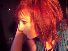
I used my computer most when creating my magazine.
Throughout creating The Beat magazine I have used my computer to research and learn a lot about photoshop and other software. I used a program called Polaroid 0.9 6R0 to give the photographs on my double page spread a sepia tone and to make them look like polaroids; giving them an old fashioned, folky feel. This kept with the theme of my double page spread and magazine.
I learnt a lot about using photoshop as I practiced between my preliminary task and final piece. I learnt how to better cut pictures out; rather than solely using magnetic lasso I chose instead to use the pen tool, eraser and smudge tool to give the photos a professional, smooth look.
I found the smudge tool the most useful as when used correctly it helped to smooth the edges of my photographs without having to feather them. This made the edges softer and made my photos blend in with the pages. I also increased the contrast a little on most of my photographs to make them look more colourful and professional. Adding a glow around my titles and front photograph made my photos look more natural on the page; they do not look stuck on.
I also used scribd to share my double page essay draft and audience feedback. This made my work look more professional on my blog and showed my technical knowledge. I also used slideshare to share my pitch and ideas with my peers. This helped as a slideshow is more interesting to look at than an essay or pictures - by sharing using slideshare I will have kept my audience engaged.