 On Photoshop I created a rough draft of what my final contents page might look like. Firstly using the shape tool i created a long black rectangular strapline across the top of my page and with my logo, the word CONTENTS and the month of the magazine's release, this was to make it look professional.
I used black and white as the main font colour but with a pink/brown as the page numbers and date of release. I did this to keep the colour palette simple but effective and sophisticated.
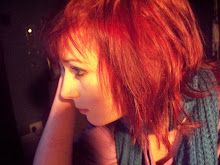
The photo I've chosen is outdoors and natural, yet the pose is stiff and I used Photoshop to make it appear a little more washed out and Wintery as when I turned up the contrast and saturation it looked unnatural.
When I create my final piece I will have more article titles, a better photograph and perhaps a more developed colour scheme and seperate article titles into sections based on the content of the articles.


No comments:
Post a Comment