The Science of Sleep Editing Techniques


The editing in The Science of Sleep trailer gives us an immediate and accurate insight into the main character. The trailer opens as the opening of the film does giving a sense of beginning and continuity. The soundtrack sets the scene as upbeat and between the words ‘Stephane’ and ‘TV’ coming on screen are 3 fast paced jump cuts of Stephane on the drums, the television, and focusing the cardboard camera on himself.

The trailer mixed long, naturalistic clips with jump cuts of his dream world to show the difference between the dreariness in his reality and the excitement of his dreams. This also gives us insight into the plot of the piece; we can see that like in the trailer half of it happens in his dreams and that this world is very important to him. The jump cuts give a sense of unprofessionalism which in this case works as Stephane has created the realms in his dreams himself; he would not be a skilled editor. It also works as in the dream world he is busy and flits from idea to idea; the jump cut shows his mental conflict and busyness.

From seeing the film I can see that the trailer is a linear narrative in the order that events happen in the film; from the very opening to the closing scenes. It is in essence a summary of the film.

During production the crew will have used a blue screen so that in post production they could add in images with a computer. The giant hands, cardboard rooms etc are a good example of this. A projector would also have been used to create the cardboard city and stop motion animation to make the train move through it etc – this gives it the jittery feel that makes it seem more homemade and effective. We can see that he has hastily created this with his mind.

When Stephane is creating something at his desk we can see eye-line match as he is looking down and the camera firstly shows us his face and then the thing he is looking at and creating with his giant hands. Cross cutting is the main technique used throughout as the dream world and Stephane’s reality are interweaved to show us the relation between the two and how he would like his world to be. In his dreams we can see that he wants to be the boss of the company he works for and get Stephanie to like him. This is a kind of parallel action as the dream world is happening when he is asleep, at the same time as his own reality.

Actors

Jamie Foxx

Jamie Foxx said in an interview that he took the role of Nathaniel as it mirrored something he went through in his childhood. As a child he had a fear of going crazy and of hospitals. When he was in college he took some drugs and had to go to hospital and was ill for almost a year; he had a friend who spoke to him every night and calmed him down. This is much like The Soloist as Downey Jr's character looks after Foxx's everyday.
When taking the role his fear came back strong and he was frightened that he could 'catch' schizophrenia and get ill. For this reason he employed a therapist whilst getting into the role as he wanted to become the character and delve deep into Nathaniel but with the help of a therapist to bring him back from the brink of going crazy. The therapist also helped with his fear by telling him what he felt was post traumatic stress from his hospital trip; not schizophrenia.
This role was a diversion from his usual roles as he usually plays parodies of other characters or people in real life; he also writes and produces more often than he acts.

Robert Downey Jr

Downey Jr was, for a change, a secondary character in this role. He said in an interview that he was simply another pair of eyes to show Nathaniel's character through and that Foxx's performance was exceptional. He was asked to play this role by the director but may have chosen to accept a secondary role as he was busy working on Iron Man 2 and Sherlock Holmes at the time of production. He also enjoyed working on this film as it is very contemporary and deals with issues that we still face today. For example it helped Robert to better understand the homeless and the role that they play in this world - he spent a lot of time with the homeless to help understand them and how to interact with them.

Mock-Up Double Page Spread


This is a very rough mock-up of my double page spread. I started by cutting out my model using the pen tool and pasting her onto an A3 landscape background. I then wrapped the text around the image and used two different shades of grey so the columns wouldn't get intermingled. I used software to change 3 photos into polaroids which gave them a sepia tone, making them look folky and old fashioned which suits the genre of music. I used a curly font for the main title and did an introduction in pink in similar font - this style gave the piece a personality similar to that of the person I was interviewing.
When I do my final piece I will use different images and fonts as the curly style was hard to read. I will also cut my model out better and make it more structured - the images and font are placed quite randomly as I didn't figure out where the middle of the article was.

Draft Interview

I asked my model Zoe a few questions, here is a sample of the double page spread interview. I will edit it further and blog it in the next couple of days fleshed out and perhaps photoshopped to look like a real magazine.

Draft Article

My Model For Front Page and Feature


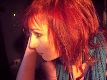
Here you can see some of the photos I took of my model Zoe. I chose her as she looks very naturally pretty and folky, she fits well with my genre and will keep the magazine feminine whilst attracting male readers; thus keeping my magazine gender neutral. For my front cover I will use one of the midshots of her looking 'moody' but for the feature I will use ones of her playing the instruments and maybe some of the more natural, outdoor ones. With it being dark it was hard to capture a natural feel but I like the creepy effect these photos have. Some of these photos were taking just messing about but I like how natural they are, you can see the hint of a smile sometimes and it makes her look a lot more confident and less stiff and posed.

Edited Photo 2


Here is another image that Owain and I took with inspiration from a Blood Red Shoes photoshoot. It was taken with a canon camera, tripod and self timer against a blue background and we used fake blood to create the 'nosebleed'. The editing techniques I used were similar to the other one, I used the pen tool to cut us out and then feathered the edges to make it more realistic. I also changed the levels of exposure, contrast and brightness so we blended in with the background. I also used dropshadow to add a subtle shadow behind us.
I like this image but I don't think I'll use it in my final piece as it looks less realistic than the other one.

Edited Photo 1


Using inspiration from a Blood Red Shoes photoshoot Owain and I copied their poses and took this photo using a canon camera, tripod and selftimer. The left image is the original and as you can see it is very different, we are sat against a bright red wall and you can see things in the background. Using photoshop CS4 I firstly cut us out using the eraser to remove some of the background and then the pen tool to cut around our shape. I then feathered the edges to make sure we blended with the background and our edges weren't too sharp. I then took the colour from the original photograph and used it as the background for ours, however I made it more white near to the centre so it looked natural.
I then used dropshadow so it looked like we were against the wall and edited the contrast and brightness of us so we looked more like the original photograph and also blended in well with the wall - it looks like we are really against it rather than cut out and pasted on. The entire process took about 2 hours but it was worth it as the final product is really effective and I might use it as either the image on my contents page or double page spread.

Contents Mock-up

On Photoshop I created a rough draft of what my final contents page might look like. Firstly using the shape tool i created a long black rectangular strapline across the top of my page and with my logo, the word CONTENTS and the month of the magazine's release, this was to make it look professional.
I used black and white as the main font colour but with a pink/brown as the page numbers and date of release. I did this to keep the colour palette simple but effective and sophisticated.
The photo I've chosen is outdoors and natural, yet the pose is stiff and I used Photoshop to make it appear a little more washed out and Wintery as when I turned up the contrast and saturation it looked unnatural.
When I create my final piece I will have more article titles, a better photograph and perhaps a more developed colour scheme and seperate article titles into sections based on the content of the articles.