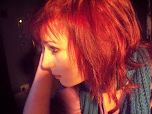
This is a very rough mock-up of my double page spread. I started by cutting out my model using the pen tool and pasting her onto an A3 landscape background. I then wrapped the text around the image and used two different shades of grey so the columns wouldn't get intermingled. I used software to change 3 photos into polaroids which gave them a sepia tone, making them look folky and old fashioned which suits the genre of music. I used a curly font for the main title and did an introduction in pink in similar font - this style gave the piece a personality similar to that of the person I was interviewing.
When I do my final piece I will use different images and fonts as the curly style was hard to read. I will also cut my model out better and make it more structured - the images and font are placed quite randomly as I didn't figure out where the middle of the article was.

No comments:
Post a Comment