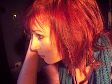
In this lesson, Cat and I began to create our front cover. As I have used photoshop before - and a lot of it is common sense - I taught Cat the basics and we started to create the cover. We used Georgie as the model and set her in the right hand side of the cover. We then cut around her and made her bigger. The background was a very light green and this worked well with the neutral gender font colours of turquoise, blue and black.
We added the headlines and made them different sizes to grab attention; the magazine was called LUTTO MAG as it is short and simple. We then had a price of £1 (which would help with sales!) and a barcode to make it look more realistic.
I think that in reality the magazine would sell quite well as it concentrated on popular teen issues and interests that both genders enjoy such as fashion, sport, music, films, a levels and stress. It also had an element of comedy in the titles of the articles for example - "McLutto - whatever happened to Jamie Oliver?" This also means that contemporary issues in the school are included which draws attention to the magazine.
Whilst I worked on the front page Cat's area to focus on was the contents; she added the coverlines and more article titles with page numbers and three pictures: one of me playing the double bass, one of Cat on an exercise bike and one of our friends Hannah and Luke performing for English Lit.
I believe these pictures showed a good range of the lessons available at school and gave Lutterworth a better, 'cooler' image to the teenage reader. The pictures are also relevant to the fact that the magazine is a school one.
We also included the school slogan "dare to be different!" as a bit of a joke but also to include some realism in the magazine. Overall I enjoyed working with Cat (again!) as we had similar ideas on colour schemes etc and didn't talk over one another.
I also enjoyed having a go with photoshop and teaching the general skills to Cat.
Subscribe to:
Post Comments (Atom)

No comments:
Post a Comment